A premium bicycle e-commerce experience created as part of the Origamid Front-End course
Role
UX/UI Designer & Front-End
Duration
4 Weeks
Tools
Figma, HTML, CSS and JavaScript

01- PROJECT OVERVIEW
Premium
e-commerce experience
This project was developed as part of the Origamid Front-End course, focusing on translating a UI design into a responsive and accessible website using HTTML, CSS and JavaScript.
Product discovery
Compare models, explore specifications and find the right bicycle through a simple and intuitive browsing experience.
Responsive experience
Designed for desktop, tablet and mobile, ensuring consistent layouts, readable content and intuitive interactions.
Clear purchase flow
A streamlined checkout process helps users complete purchases with confidence through clear and predictable steps.
02- DESIGN SYSTEM
Scalable design system
I defined reusable typography, color, buttons, inputs and icon patterns to keep the experience consistent from design file to front-end implementation.
Typography
Poppins / Roboto
Heading
32 / 40
Subheading
24 / 36
Body
18 / 24
Caption
16/ 24
Label
12/ 16
Colors
Primary
Secondary
Background
Components
Button
PRIMARY
SECONDARY
Input
contato@email.com
Icons
03- FROM DESIGN TO DEVELOPMENT
From Figma to code
The interface was implemented using semantic HTML, modern CSS and JavaScript while maintaining consistency with the original design.
Figma
Design
Components
& UI Kit
HTML
Structure
CSS
Styling
JavaScript
Interactions
Responsive
Website
04- WEBSITE STRUCTURE
Pages & structure
The website was organized like a real e-commerce product, with clear paths for discovery, product detail, contact and conversion.
Home

Bikes

Bike Details

Contato

05- RESPONSIVE DESIGN
Responsive experience
Layouts were adapted for desktop, tablet and mobile to protect readability, hierarchy and buying confidence on every device.


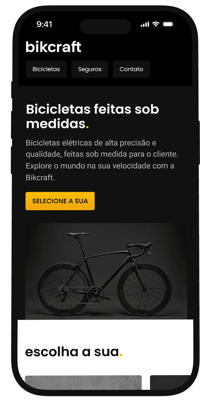
06- FINAL WEBSITE
The final result
A modern, fast and responsive e-commerce website that connects product storytelling, interface design and front-end execution.

07- REFLECTION
What I learned
This project strengthened my front-end development skills and improved my ability to translate UI designs into responsive, production-ready interfaces.
Design systems improve consistency and speed.
Responsive design is essential for usability.
Clean code makes iteration easier.
Testing interactions leads to better solutions.
08-NEXT STEPS
What's next
Next iterations could make the e-commerce flow more complete with higher-converting shopping and account features.
Shopping
cart
Product
filters
User
accounts
Payment
integration
Performance
optimization
Let's create meaningful digital experiences together.
© 2026 Jussara Pastre.